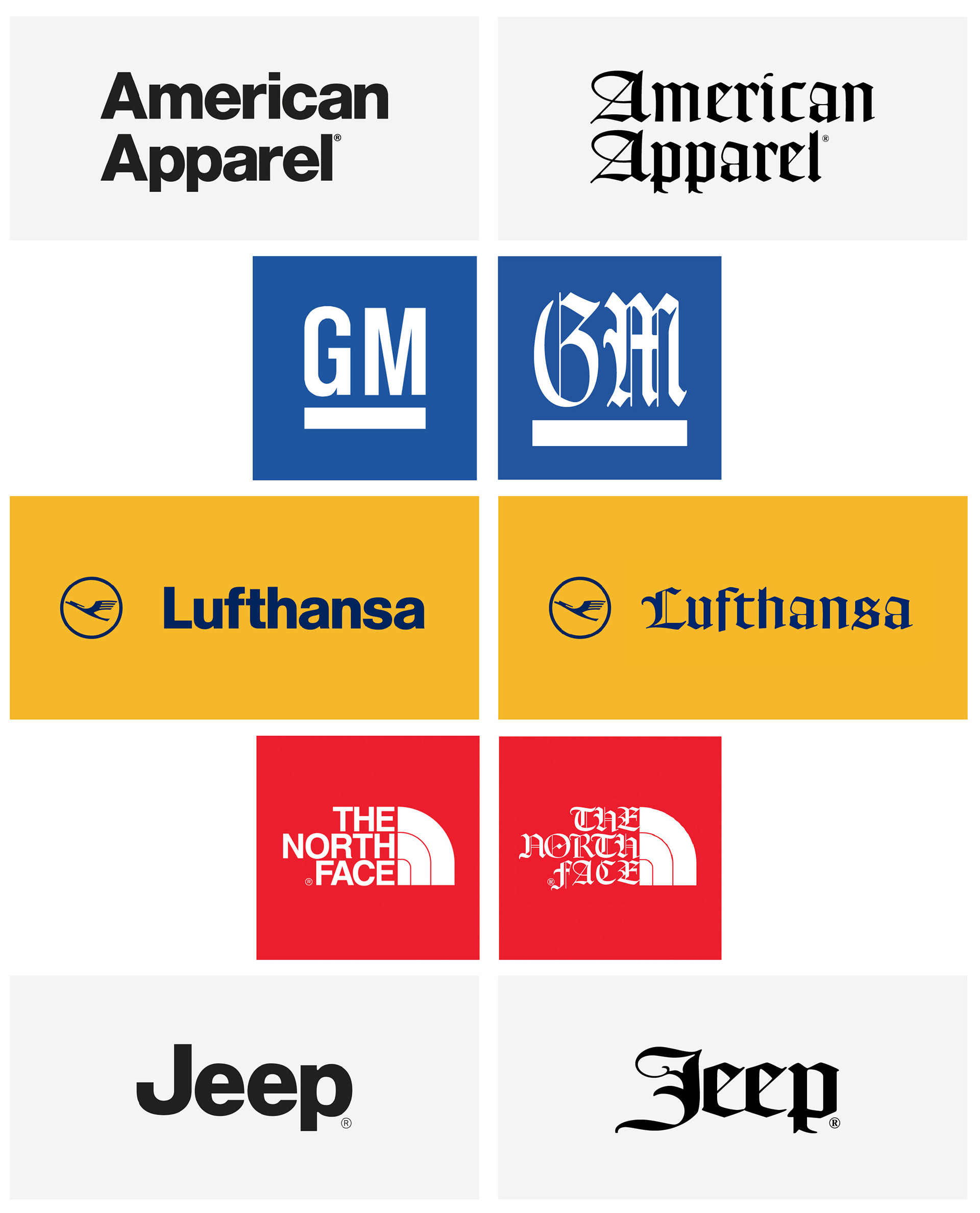
The School of Graphic Communications Management (GCM) recently aquired several cases full of metal type from a variety of type families for use by its letterpress course and student group. As a member of the Ryerson Letterpress Club, I have been able to been able to explore these cases and discover many of the interesting typefaces they contain. One of my favourite additions to GCM’s collection is a typeface in a case simply labeled “Similar to Hevetica.” A Textura blackletter typeface, it is unmistakenly not similar to the modern, sans serif Helvetica. However, I found the irony of this mislabelling amusing and knew I needed to do something with the typeface. Fortunately, after doing some research, I was able to determine that the typeface was actually called Goudy Text. With that knowledge, I decided to exemplify the dichotomy between Goudy Text and Helvetica by recreating logos that use Helvetica with Goudy Text instead. Although this project was inspired by metal type intended for letterpress use, the logos were recreated digitally to accurately represent additional logo features (e.g. the Lufthansa crane) and to account for the use of capital letters (which are not included in GCM’s collection).